
Loading...

A mobile-first content strategy means you plan, write and format every page for a phone screen first, then enrich it for larger screens. In practice that means short answers under clear headings, content that is identical on mobile and desktop, and testing on real devices before you publish. This guide shows how to do each of those, step by step.
Mobile-first is an approach to web design and development that prioritizes small screens over large ones. MDN describes it as starting with an experience that works well on small screens and enriching it as the screen size increases. It also frames designing for desktop first as a backward way of thinking.
A content strategy takes that idea one step earlier than layout. Before anyone draws a template, you decide what the page must say, in what order, and what a person standing in a queue with one thumb free needs to get from it. Layout then serves the content, not the other way around.
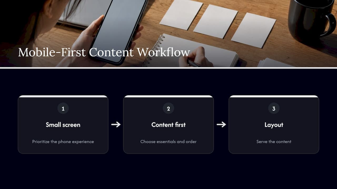
That is why the web.dev team calls mobile-first a focusing constraint. A small screen forces you to show essential content and key tasks first, without detours or interface clutter. If a paragraph cannot survive on a phone, it often did not earn its place on desktop either.
The three terms get mixed up, and the difference shapes your workflow.
| Approach | Starting point | What it means for content |
|---|---|---|
| Mobile-friendly | A desktop page that still works on a phone | Content is often too long, with mobile as an afterthought |
| Responsive | One page that adapts its layout to any screen size | Layout adapts, but content priorities may still follow desktop |
| Mobile-first | The smallest screen, scaled up | Content priorities are set for the phone, then extended |
The Interaction Design Foundation puts the distinction this way: mobile-first starts with the smallest screen and scales up, while responsive design adapts layouts and does not necessarily prioritize mobile. They are not rivals. Most mobile-first sites are also responsive.
MDN's responsive design guide gives a common example: start with a single-column layout for narrow screens and add columns at wider sizes. That pattern is mobile-first thinking applied to CSS.
For most teams the practical choice is simple. Google recommends responsive web design because it is the easiest pattern to implement and maintain. Build responsively, and let mobile-first decide what content goes in first.
Google's mobile-first approach means it uses the mobile version of a site's content for indexing and ranking. If your desktop page has a section that the mobile page hides or removes, Google may never see it.
Google's mobile-first indexing best practices, last updated in December 2025, boil down to a checklist you can apply to every article:
The lazy-loading rule matters most for content teams. Accordions are fine when the text is in the page and simply collapsed. Text that is fetched only after a tap is a different thing, and it can be invisible to search.
A useful habit: every time you cut text to make a page shorter on mobile, ask whether you are cutting it from the page or only from the phone view. Cutting it from the phone view is a ranking decision, not a design one. If your goal is search visibility, read our guide to user intent in content strategy to decide what each page really has to cover before you trim anything.
Structure is the largest lever in a mobile-first content strategy. Phone readers scan first and read second, so the page must let them find their part in seconds.
Berkeley's web guidance recommends clear, logical H2 and H3 headings built around user questions, each followed by a direct one or two sentence answer. That format works for readers and for search, since it gives both a clear answer near the top of each section.
A quick test: read only your headings on a phone. Can you tell what the page says and where to find the part you need? If not, rewrite them.
The same Berkeley guide recommends tables or lists over dense prose. On a narrow screen a six-line paragraph becomes a dozen short lines and loses its shape. A list of four items stays readable.
Keep tables narrow. Two or three columns fit on a phone. If a comparison needs six, split it into two tables or turn each row into a short labeled list.
Berkeley's advice is also to avoid embedding essential text in images. On a phone the image shrinks, the text becomes unreadable, and screen readers and search engines cannot use it. Put the words in the page and use the image to support them. For ideas on pairing images with text, see how visuals in blog posts boost engagement and SEO.
A useful rule of thumb is two to three sentences per paragraph, with the main point in the first sentence. This is an editorial habit, not a technical standard, but it fits how people scan a small screen.
Take a paragraph on a desktop article about email subject lines:
Before: A long opening about why subject lines matter, followed by five tips buried in one block, then a closing thought.
After: A heading, "What makes a subject line get opened?", a two-sentence answer, then a five-item list with one short line each.
The content is the same. The second version can be read in a few seconds on a phone and still works on desktop.
Content strategy includes how people move between pages. Berkeley's planning guide suggests a shallow navigation structure of no more than three levels. The Interaction Design Foundation notes that human memory holds roughly 5 to 9 items and recommends keeping navigation to the essentials.
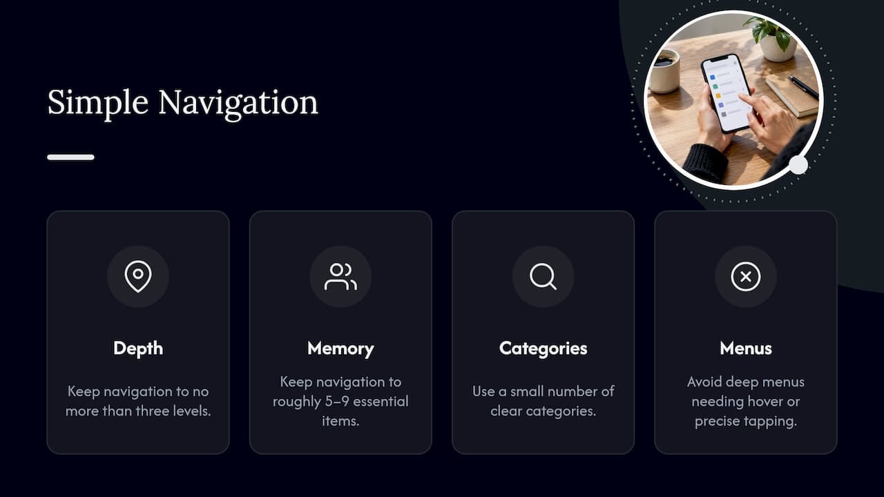
For a content site that means a small number of clear categories, internal links placed inside the text where they help, and no deep menus that need hover or precise tapping. Clear navigation also helps search engines understand your site, as this piece on why clear navigation matters for SEO explains.
Accessibility and mobile-first overlap more than most teams expect. The W3C says the Web Content Accessibility Guidelines (WCAG) 2.2 cover web content on any kind of device, including mobile, and that following them often makes content more usable for everyone.
One criterion is directly about phones. The reflow requirement says content must be presentable without loss of information or functionality at a width equivalent to 320 CSS pixels for vertical scrolling content. In practice, readers should not have to scroll sideways to read a line of text or use a feature.
For content writers this means:
If you manage a small site and want a plain-language starting point, these website accessibility basics for small business owners are a helpful companion to the WCAG text.
A page that takes too long to load loses the reader before the first heading. Google's web.dev explains that Core Web Vitals measure loading (LCP), interactivity (INP) and visual stability (CLS). Content decisions affect all three:
As an editor, you control the number and size of images, the embeds you add and the placement of promotional blocks. Treat each one as a cost to the reader's phone.
A practical way to run step 7 without a device lab: ask three colleagues or customers to open a page on their own phones and complete one task, such as finding a price or an answer, while you watch. Note where each person hesitates.
Mobile-first formatting does not replace quality. Pages still need to be useful, original and written for people. Our look at Google's helpful content guidance and SEO authenticity covers why a page that reads naturally and answers a real need tends to hold up better than one written to a formula. Mobile-first is the delivery method for that kind of content, not a shortcut around it.
Most teams treat mobile-first as a design problem. We see it as an editing problem. The hardest part is not the layout, it is deciding what a page can lose and still do its job.
That is also where AI-assisted drafting often falls short. A first draft from a language model tends to be long, evenly paced and padded with transitions, which is exactly what a phone reader skips. Our platform is built to restructure text so it reads more naturally, with shorter, clearer passages, while keeping the meaning and working your target keywords in where they belong.
Our approach is to treat a draft as raw material: tighten it, vary the rhythm, put the answer first, and make sure the final text sounds like a person wrote it for a person. Used that way, a humanizing tool is part of the editing workflow, and the mobile-first checklist in this guide is the standard you edit against.
Tilen
If your drafts start with AI, the editing step is where mobile-first happens. Semihuman restructures AI-generated text so it reads more naturally, supports keyword integration for SEO, and is designed to keep your meaning intact. You can try it on a real article and then run it through the mobile checklist above.
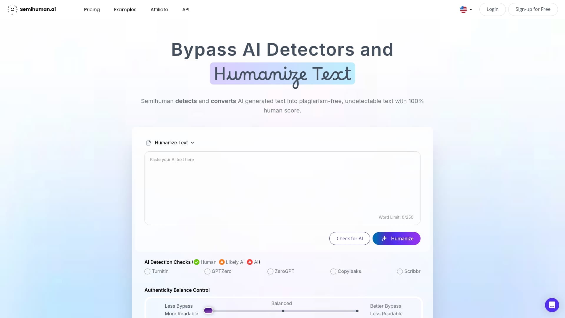
Individuals can compare the Free, Basic and Pro plans on our plans page, and teams who want to build the tool into their own publishing workflow can look at the API plans. You can also start from the Semihuman homepage.
They are plans for creating and formatting content for phone readers first, then extending it for tablets and desktops. The idea follows the mobile-first approach MDN describes: begin with what works on a small screen and enhance from there. In content terms, that means short answers, clear headings and essential information up front.
It is a design method that starts with the smallest screen and scales up as space grows. It differs from responsive design, which adapts layouts to any size without necessarily putting mobile first. Most modern sites use both together.
Google uses the mobile version of a site's content for indexing and ranking. To be safe, keep the content, headings, metadata and structured data equivalent on mobile and desktop. Also avoid content that only loads after a swipe, click or typing, since Google will not load it.
There is no official length. Let the reader's task decide: give the answer in the first one or two sentences under each heading, then add only the detail that helps. If a section can be a list or a small table, make it one.
No. Google recommends responsive web design because it is the easiest pattern to implement and maintain. If you do run separate mobile URLs, make sure the content and metadata match the desktop version.




Start
Humanizing
for Free!
Humanize